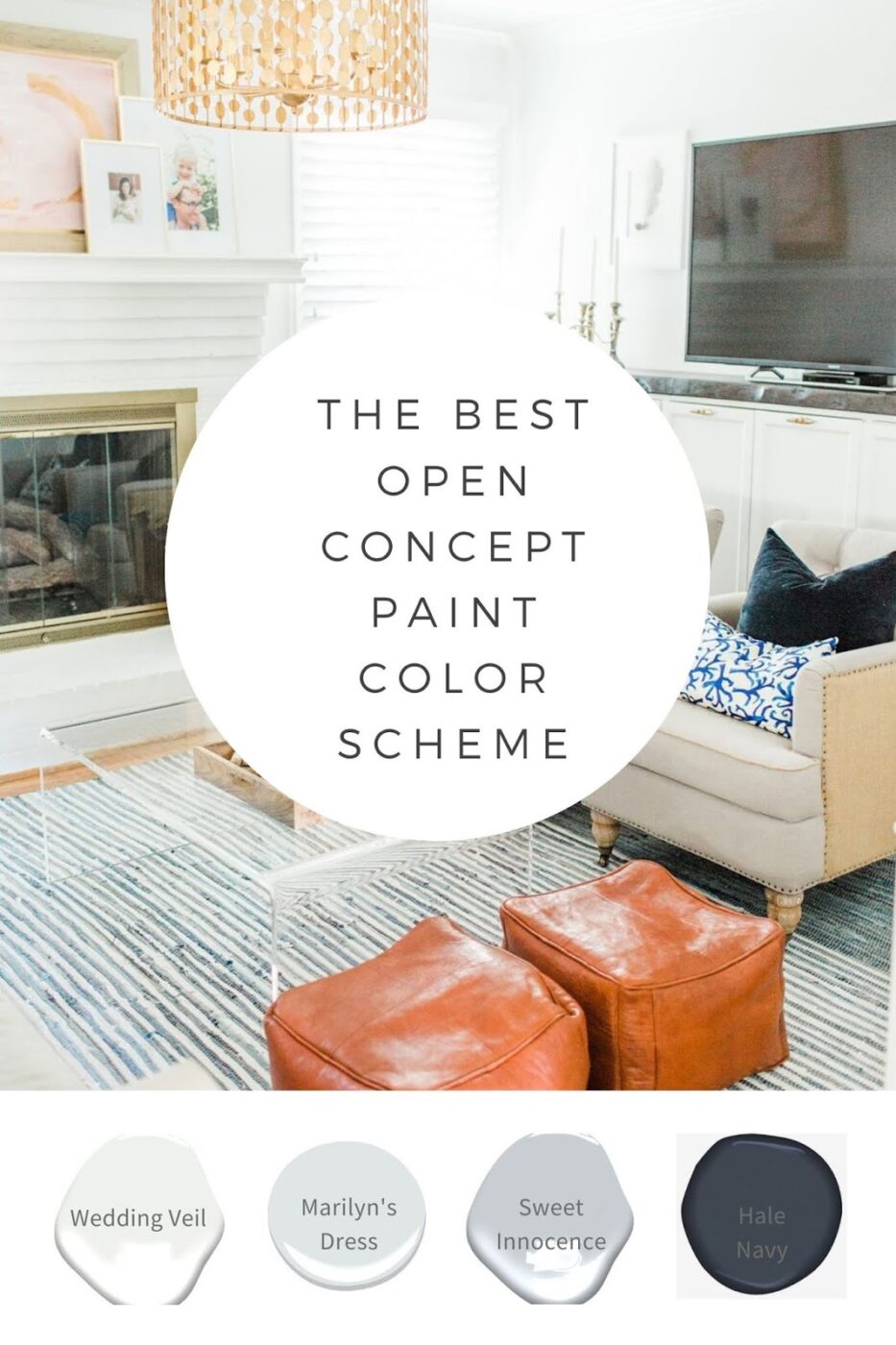
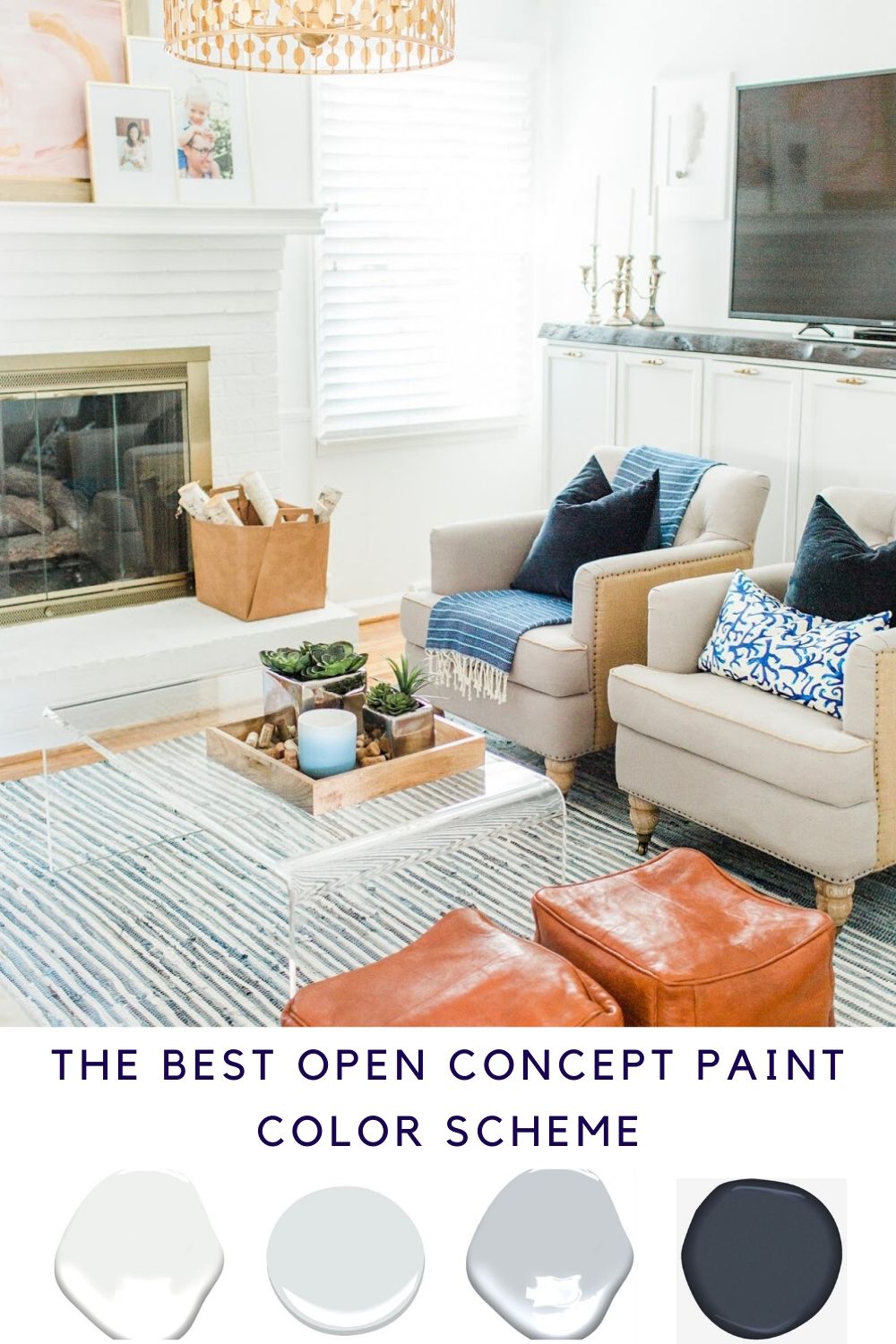
The ceiling and trim work will be painted Ben Moore’s Wedding Veil. Wedding Veil is a gorgeous true white with blue based undertones. It’s very bright and crisp, playing well with shades of blue, grey and purples.
The bedrooms and two full baths will get different colors outside of the grey family (and a post of their own), but the “opens spaces” (the living room, dining room, kitchen, family room, mud/laundry room) will all be the soft silvery shade of Ben Moore grey, Marilyn’s Dress.
The office play room will be separated from the main space by glass French doors so while it will be it’s own room, it will be clearly visible. Keeping that in mind, I went just a shade or two darker on the color swatch from Marilyn’s Dress and found Sweet Innocence.
For accents in both decor and paint, we’re choosing navy! My favorite navy is the deep, rich tone of Hale Navy.
I won’t lie, I am probably the most low maintenance Paint Selector (I’m making that a thing) in the history of time.
I really don’t hem and haw over shades and colors, I never paint swatch or test and I typically don’t even bother with grabbing paint color cards from Lowe’s.
My typical mode of selection involves a little Pinterest browsing, some light Googling and then slapping it on the walls.
I think the key to choosing paint colors efficiently and being pleased with the end results lies in knowing what color family you gravitate towards.
I don’t care for shades of tan or off white. Anything that could be considered cream, ecru, ivory or taupe is a big No for moi.
After learning what you don’t like, knowing what tones you find pleasing to the eye is the next step.

In most cases, I prefer a bolder color choice than my husband so I always make myself choose a color one shade lighter than the one I fall in love with. In my experience, paint always dries darker than the color on the swatch (another reason why I like to check Pinterest for images of “real” rooms).
Picking soft neutrals like our new main color for our open convent reno means that I can bring in bold pops of pattern and color with my decor – a wild animal print pillow here, a fun painting there, a rug in a non traditional texture – all of it allows me to add a little personality without overwhelming my husband’s senses.


Love these color. I am a huge fan of the gray family. I was able to put some gray in one of the bathrooms and my sons nursery and play room.
Great choices!
I love, love, love these paint schemes!!! You're giving me the paint bug to get rid of our beige walls 😉
love the colors and can't wait to see the progress!!! we gravitate to those same colors and I love our gray walls that are painted throughout our entire house!!!
I love Marilyn's Dress! I also pinterested around looking for real rooms and I think it's going to be fantastic for big spaces!
I am currently looking to paint all of my "open spaces" as well and I'm trying to decide between a lightlightlight grey or pure white. AH! So hard.
We live in a new build that is cream through out! I am so fed up with it and we are suppose to leave it for another year and a half – I can't! I need to get into Pintrest because it looks like it might save me some time. I love the grey and I have a white kitchen too, it makes all the difference. I can't wait to see what it turns out like X
Love the colors- I am sure they will look lovely! I do the same thing with paint– I find a color I like go on Pinterest and look for real rooms, this is how I chose all the colors in our current house! Who has time for color testing??
Love the colors! Yay for white kitchen cabinets, it brightens up the space so much!