


Our kitchen renovation is finally done! With just a few days to go until baby girl arrives, I am so excited to say that we are officially moved into (and using!) our new kitchen. This space was by far the most dramatic renovation of Phase 1 but for all intents and purposes, the renovation process went oh, so smoothly and we couldn’t be more pleased with the final product.
Shop my faves for our home:


Let’s start with the Before and During photos and I’ll walk you through what went down along with the After shots!
Before:


During

The goal was to open the kitchen to the rest of the living spaces as much as possible. We wanted to be able to see our kiddos in their play space and into our living room for entertaining purposes. We knew the center wall would have to come down and were over the moon to find that it was not load bearing. Tearing down that wall/bank of cabinets meant relocating the fridge but the solution was fairly simple and removing that wall to create a peninsula was a home run.


no more wall – and the bank of cabinets that held the oven and microwave bit the dust, too!

This space just off of the kitchen was used as a joint hang out space and dining room by the previous owners and we wanted to use the space for the same purposes, but flipped the dining space to line up with the kitchen. For a while, the refrigerator had no where to go but smack in the middle of the soon to be dining room.

When deciding what to do with the refrigerator, we opted to brick over a door that actually served no purpose – I can only assume that, at some point, our lot was much bigger and the door opened to a side yard. When we purchased the home, it literally opened to our neighbor’s driveway, so we decided to use the space to house the refrigerator, allowing us to open the kitchen to the living room .
You can see the new wall and framing for the fridge in the shot below

And sadly, there were no hardwoods hiding under the linoleum in the kitchen – we were hopeful but struck out on that one.
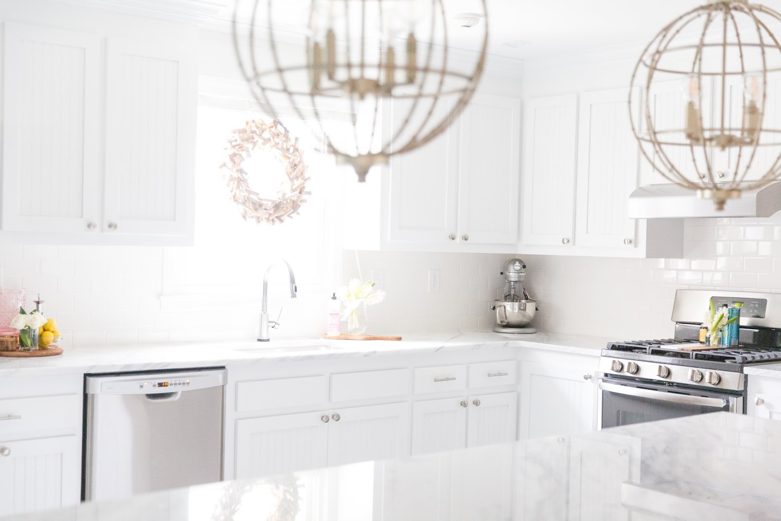
Ok, ready for the after photos?? The sink was swapped out but stayed in the same place so it’s a good visual reference to keep your bearings.
All after shots by Christa Rene Photography
After


You will definitely spot some similarities to our last kitchen renovation – the round pendants over the island and the granite have a very similar feel to our last project – but to me, this kitchen has much more of a country cottage feel. The open shelving, slatted cottage cabinet doors and the floor tile really soften the modern edges of the stainless appliances and white walls. I’m never one to choose one decor style and stick with it (I think home design should be a mix of what makes you happy) so I love the blend of the large bamboo pendants with the linen covered bar stools (also from our last house) and the pops of blue from our Jockey Lot art and the Target dollar aisle finds in the open shelving.
Also, if you know what the Jockey Lot is, I love you and your South Carolina roots. Let’s just say calling the Jockey Lot a “flea market” would be a compliment….but Justin and I purchased that piece together when we were dating and man do I love that canvas!


Unlike our last renovation, there were elements of this build that we really wanted to keep – for both budget and sanity purposes. The cabinet boxes were original and handcrafted from real wood, so we knew we wanted to keep as many of them as possible. The doors had been replaced with soft close, cottage style doors in the past couple of years, but luckily matching doors were easy to source. To update the look of the cabinetry, we swapped out the dark pulls for classic nickel and removed the wood trim detail above the sink. We replaced the trim with thick crown to reduce the visual space between the cabinet doors and the ceilings and to give the cabinets a more custom look. I love how much the crown added to the look of the cabinets – that was an absolute reno win!

All of the tile credit goes to Amanda Louise of Amanda Louise Interiors – I was really stumped when sourcing tile because, while I love the look of the painted concrete tiles that are so in right now, I really wanted to lighten the space up and not blow the budget. Amanda found our tiles on Wayfair and I honestly said you can stop looking, those are perfect. We will carry this tile from the kitchen into what will soon become our new mudroom/laundry room/back entrance and I think it will be the perfect neutral pattern.


My husband is crazy excited for his new wine fridge and has reminded me that my two buck chuck doesn’t really need to be chilled to a certain temperature more than once since move in day…

It wouldn’t be one of my renovations if there wasn’t a “happy accident” and the open shelving fits the bill this go ’round. I honestly wanted open shelving on the wall where the art piece is hanging but we decided it was a visual mistake with the pendant lights. I must have missed the memo when we were planning cabinets and assumed there would be a cabinet over the fridge – but when we moved in, there wasn’t a cabinet, just an unused space and gorgeous trim work at the ceiling line. I asked Justin to install inexpensive white shelving (literally white shelves and white metal brackets from the closet section of Lowe’s) so I could use the space for storage without ruining the trim work or paying for a custom cabinet and I love how it turned out.


In the photo below, you’ll see what looks like an exterior door and a big blank wall – that door will soon be removed to make the new hall to our master suite, the mudroom/laundry room and new exterior entrance. Once Phase 2 is done and that door is removed, I’ll get around to really decorating that wall but until then, it’ll just hang out, waiting for it’s day in the sun.


Overall, I think we achieved all of our goals with the space! The kitchen opens to the living room, I can see into the play space and we have an eat-in area where we can sit as a family. I still have some decorating to do, but without a doubt, this little house is starting to feel like a home.
So what do you think?? I’ll list all of the sources below but as always, if I missed something please comment and I’ll link it up for you!
Sources:
Wall and trim paint color: Benjamin Moore Wedding Veil
Island paint color: Benjamin Moore Marilyn’s Dress
Kitchen Table: Vintage/purchased at a vintage store in Charlotte roughly ten years ago, similar
Art: The Jockey Lot 😉
Amazing Before and After Transformation. I really loved it. Everything is perfect and specially loved designer hanging lamp.
Thanks and keep sharing 🙂
Ah-mazing!!! We're on our third kitchen reno and this has me all sorts of pumped!
Wow it looks soo great! I'm obsessed with your light fixtures! Come decorate my house 😉
GIRL. This looks SO GOOD. No idea how you do all this with a toddler and prego. You are superwoman, mama! So impressed. Enjoy your new beautiful kitchen!
xoxo
Sandi
Gorgeous kitchen reno! What countertop did you go with?