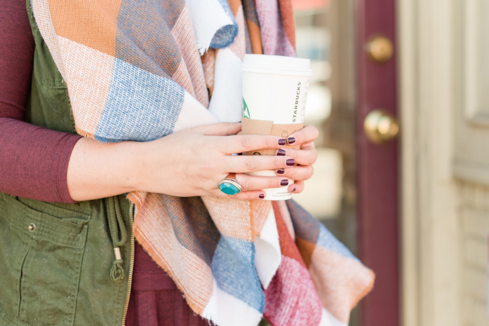
photo by Christa Rene Photography
Well, well, well, look who got herself a new outfit!
I haven’t updated the look of the .com since before she was a .com, so I thought it was high time to shake things up around here.
I’m in love with the new layout by MunichParis Designs – especially the new nav bar that holds all of my social media icons and the over sized sliding images that link to my most recent posts. If you aren’t into all of the fancy gadgetry, just scroll down and you can read my posts in their regular format. If the design looks a little off, make sure you are running a newer version of your software – it looks prettiest with the freshest operating system.
And, yes, I kept my hand made, chicken scratch title because I just couldn’t let that thing go. I originally doodled my (then under wraps) blog name to show a designer what I was envisioning and we popped my graphic in as a place holder. After a while, my doodle turned into a logo and I can’t seem to let it go. Get comfy, chicken scratch version of Olive and Tate, looks like you’re here to stay.


It looks great! So simple and clean!
Love the new look!!! It's looking great! And I love your personalized title and am glad you decided to keep it 🙂
Looks fantastic! I love that your title is a doodle. So personalized!
I;m glad you kept your handwriting! That's my favourite part!
LOVE the new look and I love your "chicken scratch" logo, glad she's here to stay! 😉
Love the new design!
Looking fabulous!!!
Love it. You are so nifty with the comp. Looks so good! xx
Looks great, girlfriend!!!
Loving the new look! And I'm glad you kept the chicken scratch 😉
i love it!! xo jillian – cornflake dreams